
14th May 2025
FlipScript
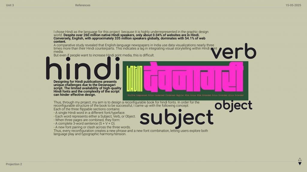
This project explores the intersection of language, typography, and physical interaction through the creation of FlipScript—a modular, tactile book that brings the Hindi language into a new typographic and experiential dimension. In an era where English dominates digital and design landscapes—with 54.1% of web content in English compared to just 0.04% in Hindi—FlipScript responds to the urgent need for greater linguistic diversity in graphic communication. Despite over 260 million native Hindi speakers, Hindi remains significantly underrepresented in visual media, design tools, and type systems.
Designing for Hindi poses unique challenges: the Devanagari script, with its complex ligatures and the shirorekha (top-line structure), requires bespoke typographic approaches. Coupled with the limited availability of high-quality Hindi fonts, this has led to a visual stagnation in Hindi print and digital design. For instance, English-language newspapers in India use data visualization nearly three times more frequently than their Hindi counterparts, reflecting a broader lag in visual storytelling in the Hindi medium.
FlipScript addresses this gap by creating a reconfigurable, interactive grammar-based book where each page corresponds to a component of the Hindi sentence structure—subject, object, and verb (SOV). The user can physically flip through and recombine these elements to generate hundreds of new sentence variations. Each word is rendered in a distinct, experimental Hindi typeface, offering not only linguistic variety but also typographic innovation. This approach encourages users to explore meaning through visual rhythm, emotional tone, and syntactic play, all within the constraints of the Hindi grammar system.By leveraging randomness, tactile interaction, and modular design, FlipScript becomes a site of co-authorship between reader and designer. It subverts linear reading habits and reinserts Hindi into contemporary design discourse—not just as a spoken language, but as a visual and material language deserving of typographic exploration. This thesis ultimately positions Hindi not as a peripheral language in graphic design, but as fertile ground for expanding how we read, see, and touch language.
FURTHER RESEARCH
Devanagari Script: Visual Features
1. Shirorekha (शीर्षरेखा) — The Top Line
- Every letter in Devanagari is connected by a horizontal line at the top.
- Shirorekha literally means “head line.”
- During handwriting or typesetting, this line connects all the letters in a word, making them visually unified.
- It breaks only at the end of a word or sentence.
2. Syllabic Alphabet (Abugida)
- Devanagari is not purely alphabetic but syllabic.
- Every consonant has an inherent vowel sound, typically /a/.
- Example: क = /ka/, ग = /ga/
- Vowel signs (matras) modify this inherent vowel.
3. Vowel Diacritics (Matras)
- Standalone vowels have full letters (e.g., अ, इ, उ).
- When vowels follow consonants, they appear as diacritics:
- क + ा = का (kā)
- क + ि = कि (ki)
- क + ी = की (kī)
4. Conjunct Consonants (संयुक्ताक्षर / Samyuktākṣar)
- When two or more consonants appear together without a vowel in between, they form ligatures.
- Example: क् + ष = क्ष (kṣa)
- न् + द = न्द (nda)
- This can make Devanagari look complex but also elegant.
5. No Capitalization
- Devanagari has no concept of uppercase and lowercase letters.
- Emphasis is usually shown using bold, underline, or quotation marks.