
15th April 2025
I had concluded “Projection 1” with the below enquiry:
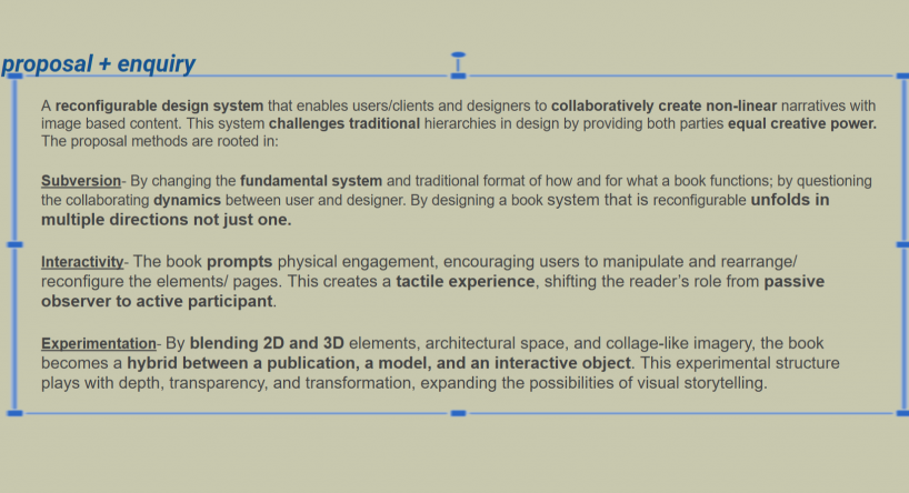
Current enquiry:
After “Projection 1”, I wanted to change the perspective of the above enquiry. I saw more potential in my design of the reconfigurable structural logic of the book, and believed it could further contribute to the graphic communication design community. However, I had reached a bit of a dead end using image based media (my interior design renders) as the context of the book, so I decided to change the context form image based to text based, while keeping the structural integrity of the book a constant.
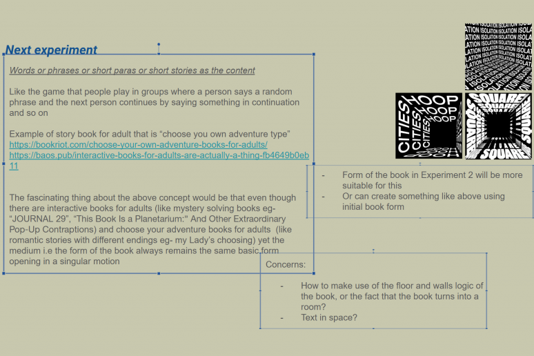
In order to investigate whether the reconfigurable nature of the book still works even after changing the context from image based to text based, I needed to come up with a new system. For instance, the the image based (interior design renders) context, the system was that the pages that are flipped to the left and upwards will always be the “walls” while the the pages to the right that remains flat on the surface will always be the “floor”. Thus when all three elements (pages) are propped up together, they form a space.
Like wise, I needed to device a system for text based context as well.
So I began researching and found some great relevant work. Click on references below to see my main references:
NEW CONCEPT:
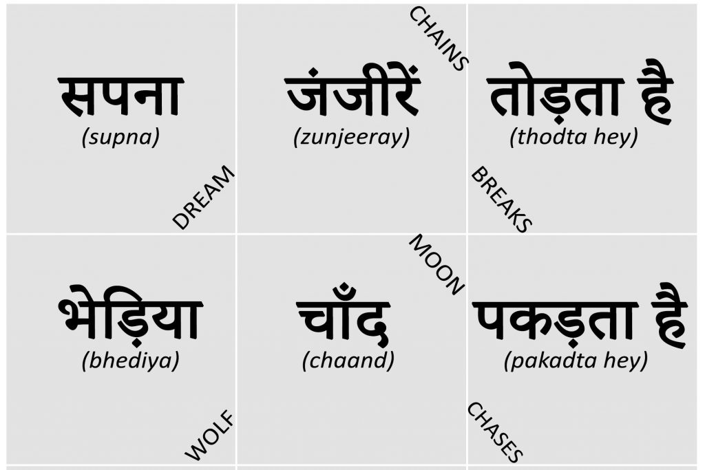
I then came up with the following system, based on some fundamentals of a language (namely English and Hindi in my context)
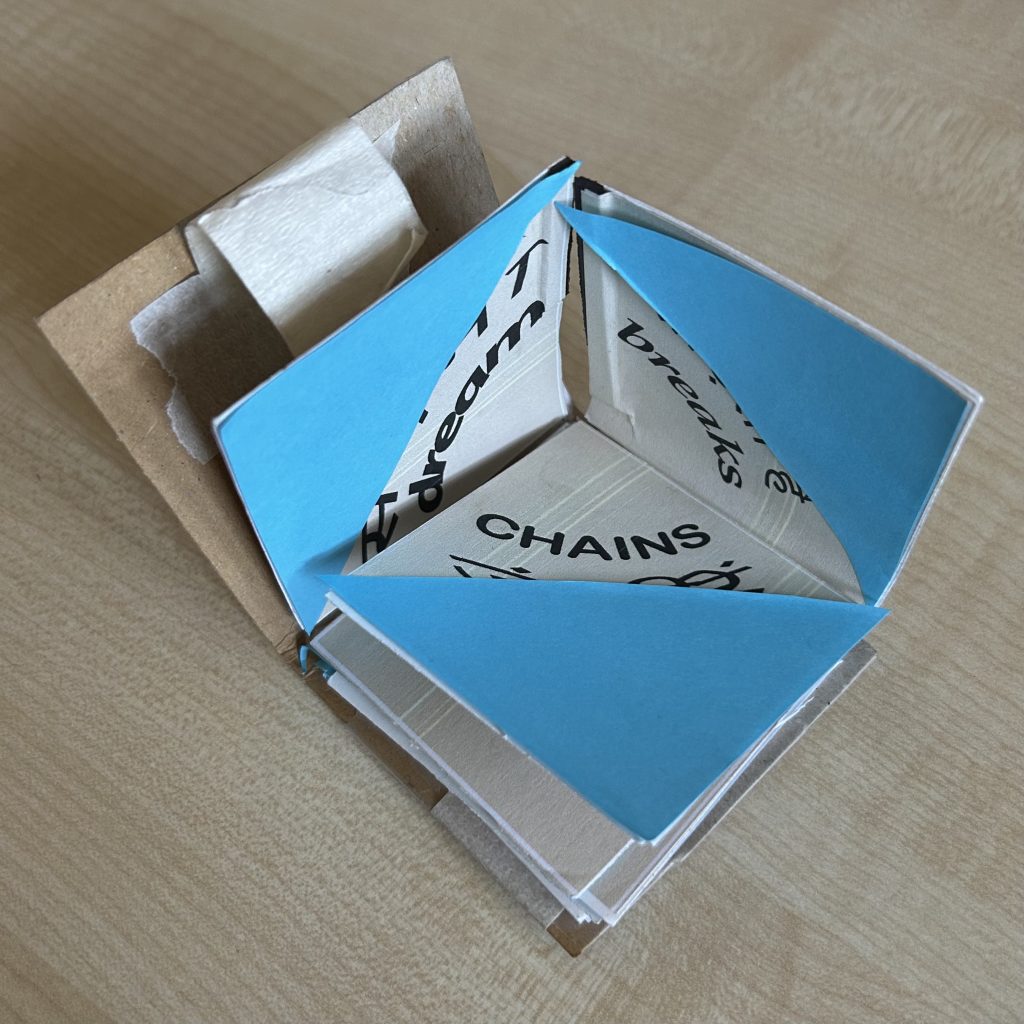
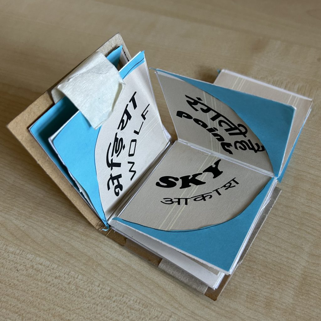
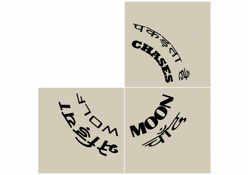
- “FlipShabd” (shabd means text in Hindi)/ “FlipScript”: A Modular Font-Play Book
- Core Idea:
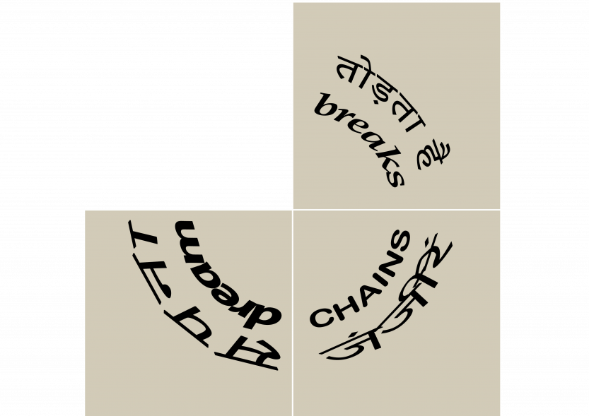
- Each of the three flippable sections contains:
- A single word in a different font/typeface.
- Each word represents either a Subject, Verb, or Object.
- When three pages are combined, they form:
- A complete 3-word sentence (S + V + O).
- A new font pairing or clash across the three words.
- Thus, every reconfiguration creates a new phrase and a new font combination, letting users explore both language play and typographic harmony/tension.
PROTOTYPE:
Below are some photos of the prototype I made of the above concept:
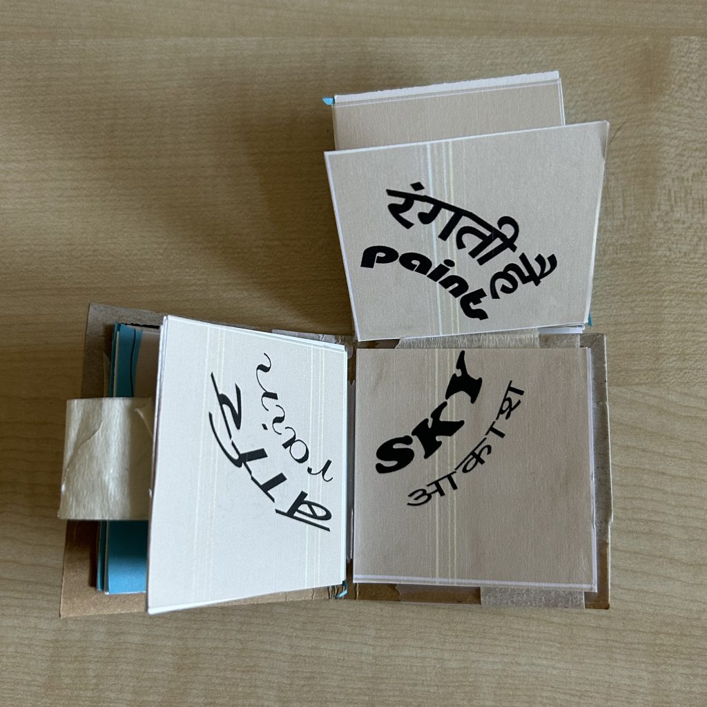
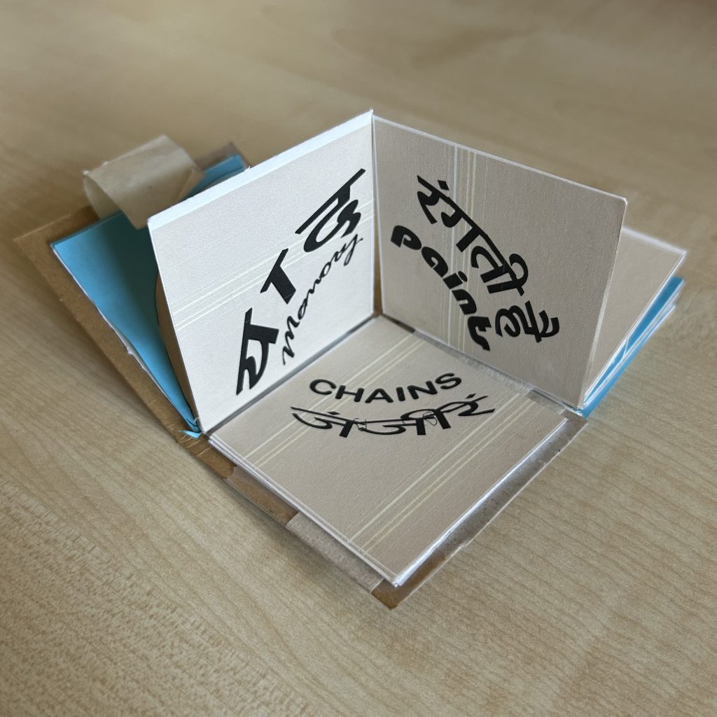
Spreads:
FURTHER CONCEPT & ENQUIRY RESEARCH:
What am I asking?
- How reconfiguration of pages create new linguistic and typographic meanings through non-linear pathways?
- Can levels of creativity be enhanced by imposing linguistic/ typographic/ modular constraints on the reconfiguration process
- Can combining subject, verb, and object across different fonts create an intuitive exploration of both storytelling (as it creates variety of sentences with different meanings) and font pairing?
- How does tactile interaction influence deeper engagement with design elements like typography, grammar, and composition?
- What emotional or creative responses are triggered when users form unexpected sentences visually and semantically?
- Can a simple, low-tech artifact (like a flipping book) stimulate deep, dynamic creativity in an era of digital interfaces?
Why am I asking?
- To push the boundaries of what modular design can communicate — not just visual space (architecture) but also language and meaning.
- To investigate how physical manipulation (versus screen-based interaction) affects creativity, imagination, and understanding of typography.
- To explore how randomness and user agency can lead to unforeseen, delightful combinations, fostering a more intuitive design process.
How am I answering ?
- By designing a tactile book where each page corresponds to a grammatical role (subject, verb, object) and each word uses a distinct font or typeface.
- By enabling modular reconfiguration — allowing users to flip and combine pages, thereby generating endless sentence and font combinations.
- By observing how users interact — noting whether the new phrases and typographic pairings inspire storytelling, mood shifts, or aesthetic discoveries.
- By documenting different combinations and analyzing which types of font contrasts (serif vs. script, bold vs. thin) generate the most engaging or harmonious results.
- By encouraging free play, testing whether serendipity in flipping pages unlocks new forms of typographic and narrative thinking.
DESIGN ENQUIRY:
This project explores how a modular, tactile book can merge the language (I choose Hindi as the language as it is underrepresented in the graphic design world even after being one of the most used languages in India) play and typographic experimentation. Each page of the book will represent either a subject, verb, or object, each styled in a unique typeface. By flipping and combining the pages, users create new three-word sentences and discover fresh font pairings. This hands-on system encourages creative exploration of grammar, storytelling, and visual design.
The core inquiry asks how physical manipulation, as opposed to digital interaction, influences creative engagement with typography and meaning. The project aims to challenge traditional approaches to type education by integrating form and content dynamically. Through curated fonts and active user participation, it investigates the emotional and narrative power of different typographic contrasts.
The methodology involves prototyping a drum leaf bound, modular book, selecting expressive font combinations, observing user interactions, and analyzing emotional and aesthetic responses. Ultimately, the project seeks to foster a playful, intuitive understanding of language structure and design composition, offering new insights into how tactile experiences can enrich modern creative practice.
This project is not just about flipping pages — it’s about flipping assumptions around language, design, interaction, and creativity.